What does it take to design an eLearning website?
Not a lot! Certainly, the crowded market suggests that it is fairly easy to design and develop an eLearning website without much fuss. Although, the popularity of eLearning solutions, has made it hard to break into the market, and that’s why for the success of the platform, you need an e-learning platform ergonomic design that drives conversion.
Ergonomic is relating to the human factor of design, and conversion-driven design relates to business success. Combined, these two can take your eLearning website to the next level. So let’s discuss exactly how to transform your platform from being mediocre to one of the best in the industry!
1. Ergonomics & Conversion-Focused Design: Why Are They Important For eLearning?
The steady growth of eLearning popularity increased when the pandemic hit. During the lockdown, about 1.2 billion children in 186 countries faced challenges when the schools were shut down. Besides the schoolchildren, numerous college students and employees in training also faced the same impact.
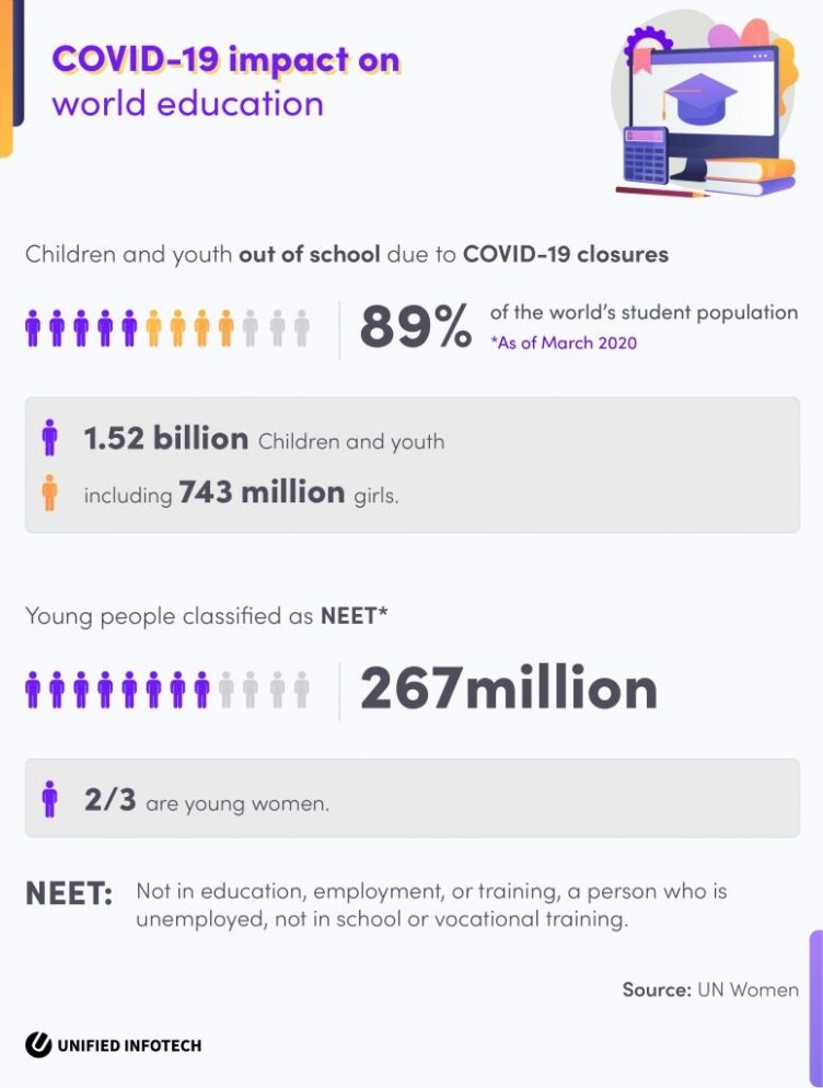
To cope with this, educational institutes and corporates expanded their online training initiatives. And now it seems that this expansion is going to be permanent. Almost all learning services are not searching for solutions to build websites like Udemy to better accommodate their students. To leverage this growing opportunity, you must understand the importance of ergonomics and conversion for the success of your e-learning platform design.
A. e-Learning Platform Ergonomic Design: Why Is It Necessary?
There are many reasons why ergonomics design and technology will be important for your eLearning platform’s future.
At this point, we all know that online learning is here to stay. Soon enough, there will be a sharp spike in the number of new online learners. And a lot of them might be unfamiliar with the inner-workings of eLearning platforms. To accommodate these new users, the application of the e-learning platform ergonomic design is going to be essential.
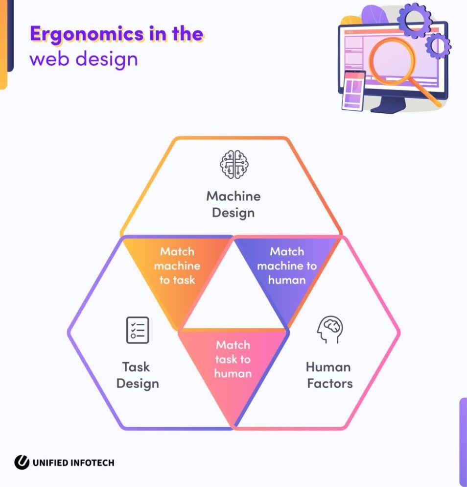
Additionally, we also have teachers who are facing the new challenges of switching from offline classrooms to online teaching. Most of these challenges are relating to the design and functionality of the platforms. With human tech ergonomic design guidelines, you can offer the teachers/instructors a better platform enabling them to offer the best of education to their students. The application of ergonomics on the eLearning platform is going to make the user’s lives a lot easier.
B. Conversion-Focused Design: Why You Must Pay Attention To It?
Conversion is the key to business success, and design happens to be the key to conversion. An ordinary user is not going to be aware of what goes on on the development end. They will only see the website, and its interface and decide whether they are going to spend time there or not. And that’s why investing in conversion-focused web design is going to be crucial for you.
From the color palette to the content hierarchy, everything will contribute to the visitor conversion. And to create an effective platform, you must optimize the design of the platform to match the latest conversion techniques in the industry.
Ergonomics and conversion-centric design are not matters of choice anymore. To succeed in a congested market full of various eLearning solutions, these attributes of design will give you a competitive edge. And that’s why to help you out, our in-house design experts have crafted the below guides that talk about how to optimize the e-learning UX design accordingly.
2. Designing For eLearning: Our Ergonomic Process
Web design ergonomic is not a static practice. It is ever-evolving with the audience, platforms, and new trends. However, there are certain things about this scientific discipline that remain unchanged-
E-learning platform ergonomic design serves as the point where the human factor meets the machine. It is the mix between human-ness and machine design, despite the form it takes.
Ergonomic elements of effective e-learning design must be usable and useful to the target audience. Any design that’s not easy to use and useful to the end consumer is not ergonomic.
And last but not the least, ergonomic design will always give you a competitive edge in the market.
With these in mind, here are some ways our design team integrates ergonomics on eLearning designs-
A. Understanding The Users: Where Ergonomics Start!
The user is where it starts from.
For a human factors ergonomics design, our process begins with understanding the users. When it comes to the human factor in design, opinions change based on the age, profession, and intention of the users. Someone who is only trying to enhance their skill is not going to have similar kind of design needs compared to a school student who is using an online platform. And that’s why we have to pay extra attention to the matter of target users while designing.
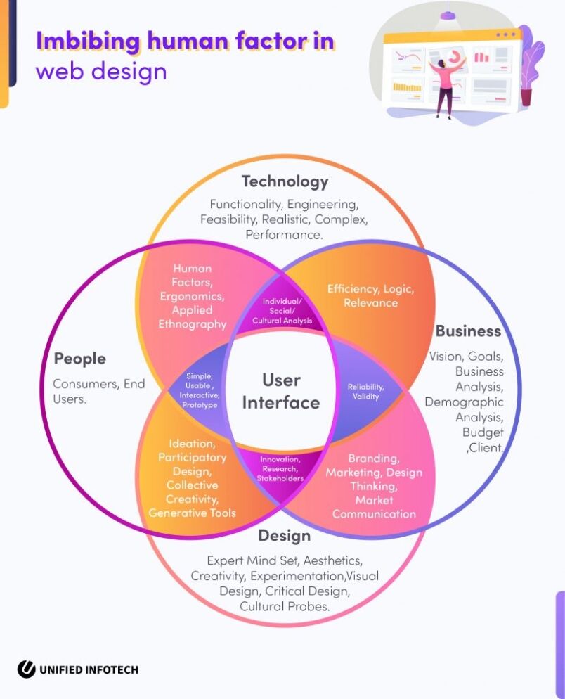
So what kind of target demographic does your eLearning platform serve? Let us take a look at the two basic groups of online learners you might encounter-
I. Generic Learners
Most eLearning sites serve the group of generic learners. These are independent and individual learners who are looking to learn something new on their own time. Some want to brush up on an old skill, while some want to complete a certification course on any professional skills. These users prefer the asynchronous learning module that gives them the freedom to learn on their own without the traditional education-related restrictions.
II. Learners With Set Goals
The second kind of users is students and employees who are using eLearning platforms for school education and workplace training. They often prefer group learning sessions with synchronous learning systems. Additionally, these users are more likely to be using proprietary platforms of their institutes or companies.
Both groups of learners have unique requirements that the eLearning platform must fulfill. And that’s why we collect all kinds of information and data before beginning our ergonomic design process
B. Keeping Up With Cognitive Ergonomic Demands With Design Psychology
Knowing the users beforehand gives us a clear understanding of their cognitive demands from the platform. And this helps us to decide on the right application of design psychology best practices.
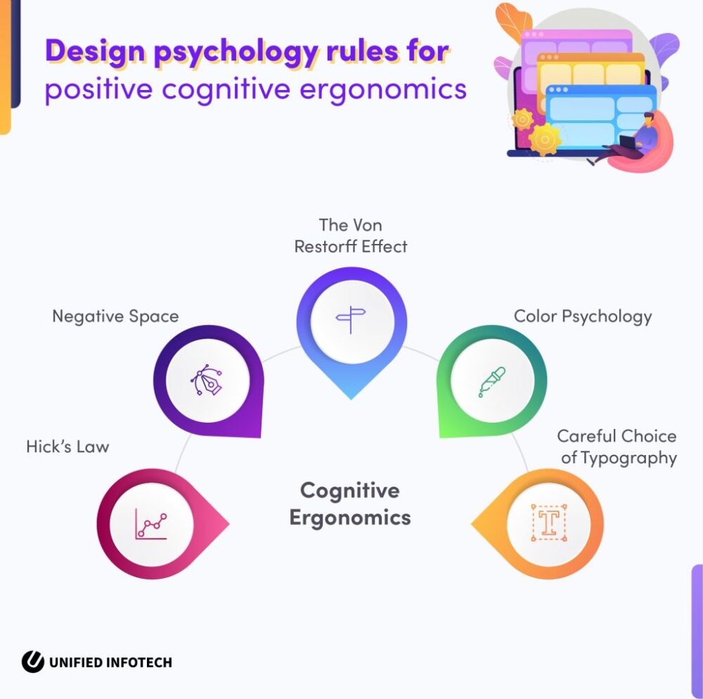
Cognitive ergonomics on the eLearning platform is necessary to pay attention to. This attribute of the website helps users to think, reason, read and make decisions easily without much stress. It enhances the overall e-learning platform ergonomic design experience, enabling users to obtain and retain information with ease.
Here are a few design psychology rules we use to improve the matter of cognitive ergonomics during the e-learning platform design process-
I. Hick’s Law:
Hick’s law is a psychological law that focuses on how long it takes for a person to make a decision based on the number of available choices. According to this, the more choices a person has in front of them, the harder time they will have in making one decision. This hardship, needless to say, will repel the user from the platform, and they will opt for some other website.
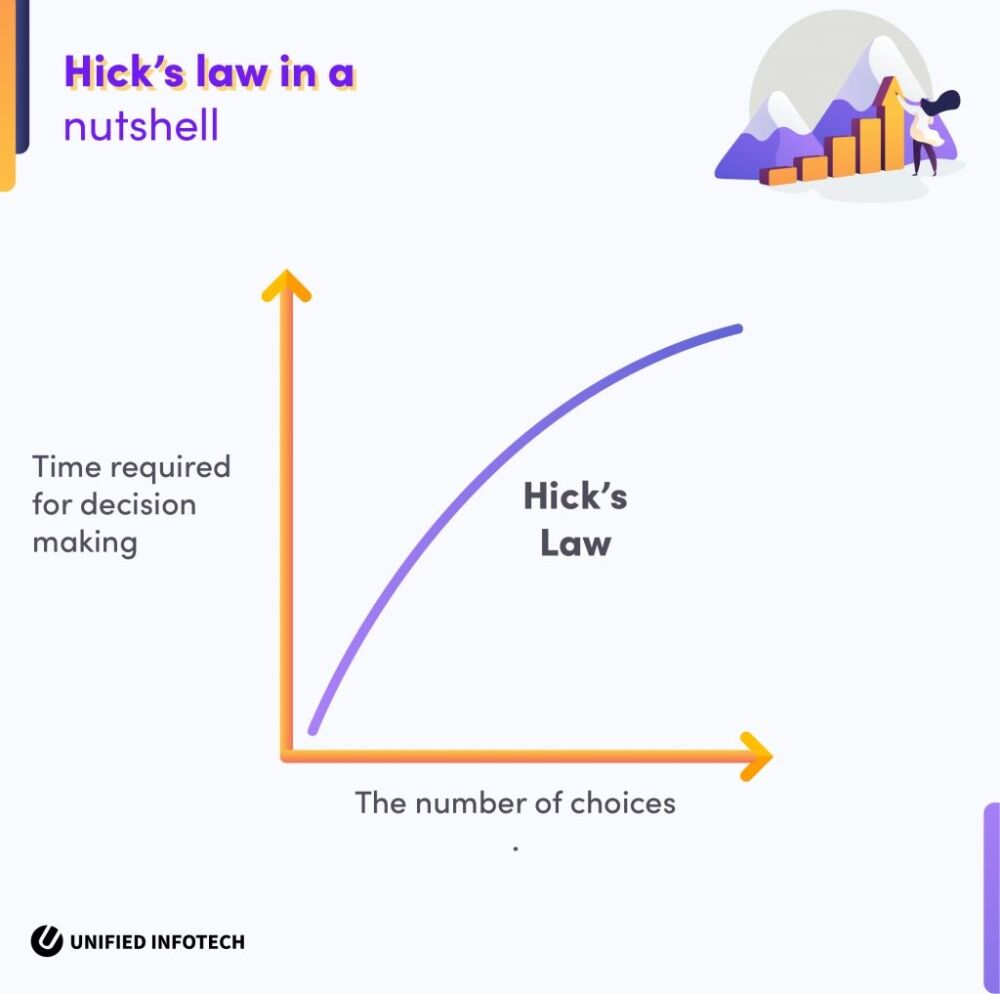
As an experienced e-learning software development company, we make use of this law to ease the experience on the platform. For example, when they are searching for a certain course, rather than bombarding them with all the courses available, we provide them with a well-sorted list. This list enables them to change the type and filter suggestions as well. This approach makes navigating the courses list easy, and reduces chances of overwhelming the users.
II. Negative Space
Learning is already a hard process for many out there. and that’s why to rest their eyes and prevent getting overwhelmed, we must integrate ample white space on the website.
The use of space between different design elements and content on the page is ideal to give the user’s eyes a bit of rest while they are consuming information and learning at a fast rate. This not only provides them with some breathing room but also improves the quality of education they receive on the site. The law of negative space is one of the major laws to imbibe cognitive ergonomic factors in design.
III. The Von Restorff Effect
Mainly used for CTA placements, this law can also enhance the cognitive ergonomic factor on the eLearning website.
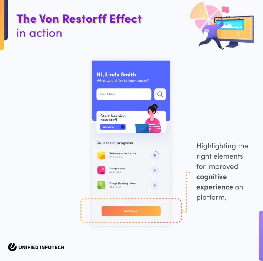
With the Von Restorff effect in e-learning UX design, we draw user attention to particular areas on the webpage. Whether it is a next slide button, or an important part of the text on the article, with this effect we can highlight the specific area the user needs to pay attention to and enhance their learning experience.
IV. Color Psychology
Color has always had a unique impact on the human psyche. And that’s why the use of color psychology is given ample importance in our design process. Keeping up with the brand consistency, we make use of colors that energizes and motivates the learners to keep on using the service to acquire more information and expand their knowledge. The use of brighter hues throughout the e-learning app and web UI makes the overall experience more soothing and encouraging.
V. Typography
eLearning websites happen to be content-heavy. The presence of various articles, PDFs, slides, and videos (preferably with subtitles) makes it necessary for us to approach the matter of typography carefully.
Rather than using fancy and hard-to-read fonts, we make use of fonts that are easy to read and are soothing to the eyes. this practice of ours helps the users to understand the text quickly. Typography also happens to be one of the most important parts of e-learning architecture design, so we ensure perfection when choosing the hierarchy.
C. Creating Consistency And Imbibing Simplicity
Design consistency and simplicity are the major criteria to fulfill when it comes to the ergonomic design of the eLearning site.
eLearning websites that are designed simply and consistently make for a better learner experience on the site. This approach of ours reduces the amount of time learners spend on the onboarding process. Additionally, it also helps them to focus on the task at hand and doesn’t surprise them with new design inconsistencies every time they log in.
Here are some of our strategies for imbibing consistency and simplicity within your e-learning platform ergonomic design-
I. Navigational Consistency
Navigational consistency stands at the forefront of our human factors-based ergonomics design process. by offering the users clear and well-sorted navigation, we can ease the learning curve on the website.
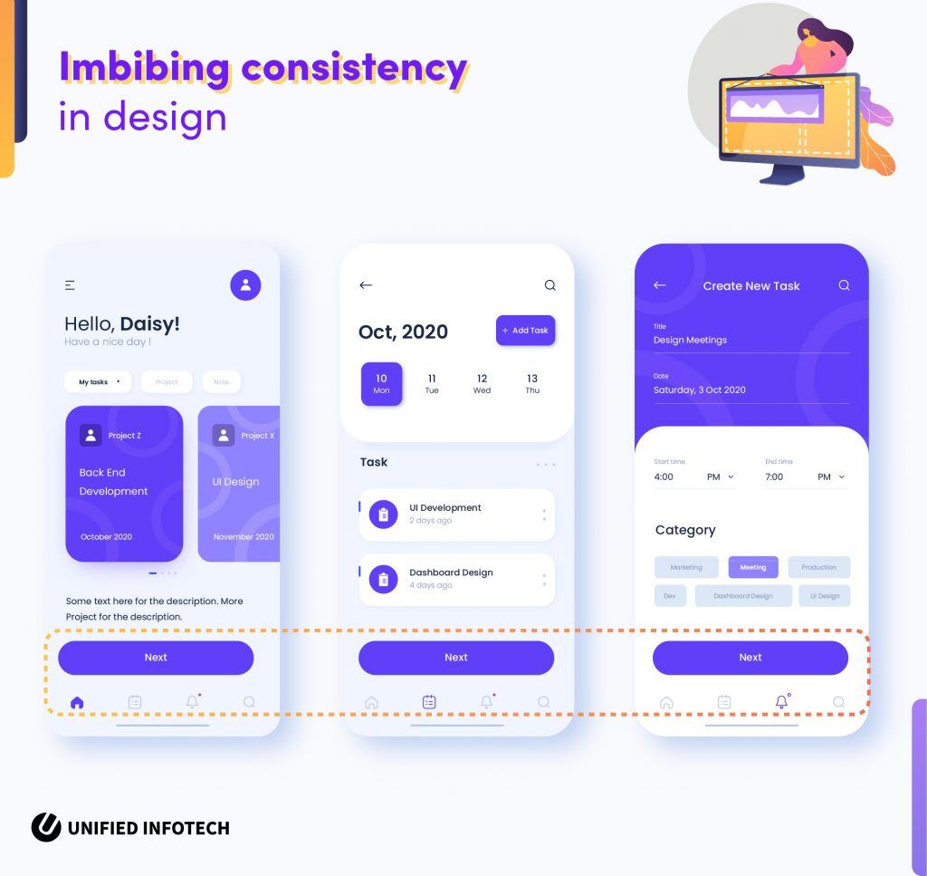
The users don’t need to scramble around to find the right option to carry out a task on the platform. The navigational queues and consistency make up a big part of our design considerations.
II. Simple Page Layouts & Navigation
For a positive learner experience, we group similar pages and apply a common design layout for them. This way learners don’t have to process a new layout every time and can navigate the website intuitively.
Our e-learning theoretical framework uses a careful positioning of common interactive elements, such as- menus, logos, CTAs, navigational queues, etc. This way we bring a sense of unity, consistency, and simplicity to the entire website.
III. Branding Consistency
Many websites, whether eLearning or any other tend to suffer from a lack of branding consistency. The absence of branding elements throughout the web pages will not only hurt your business but ruin the consistency throughout the platform. And that’s why our agile software & website development process focuses on subtly imbibing the branding elements throughout all the pages. This way we can improve on the ergonomic quality of your platform while also enforcing the branding of your eLearning platform.
A consistent design is simple to understand, and a simple design is consistent through and through. Our ergonomic design process for your eLearning website relies heavily on these two pillars. In the end, the aim of our web & software developers remains the same- to create an eLearning website that enables the users to experience the best of the platform.
3. Conversion Design: Making eLearning Platform Impactful
Due to the ease and benefits, eLearning is now a dominant trend in the world. And just like every other trendy thing, the partakers of this market are many. To stand out among the rest and garner more users, you must have a cutting-edge conversion-driven design strategy for the eLearning site.
Here are a few pointers from our design experts that will increase the conversion rates through the e-learning UX design at a rapid pace.
A. Optimizing The Content For Speed
eLearning sites tend to be full of numerous visual content such as videos, slides, images, etc. And for the website to function properly, we optimize all the visual design content carefully to increase conversion. Here are some specific parts of our entire process that enhances conversion on the platform-
I. Using High-Quality Visual Content
Low quality of visual educational elements would cause the users to lose interest and leave the platform as soon as they land on it. And that’s why as an experienced custom software & web development company, we make use of high-quality visual elements to intrigue the users from the very beginning.
II. Optimizing Content For Site Speed
On one hand, you need high-quality images and other visual content. On the other hand, these elements need to be optimized for better speed as well. The users want a seamless experience on the platform, and to facilitate that, we follow site speed optimization best practices, so that the users can learn without any delay.
III. Text Content Quality & Language
The text elements on the website, whether it is part of a curriculum or homepage text, must fit into the expectations of the audience. The same kind of text content will not satisfy different kinds of demographics. And that’s why we ensure that the content elements of effective e-learning design are consistent with user expectations.
B. Familiar Hierarchy Of Content And Elements
Website content hierarchy is all about providing value to the users. As the owner of an eLearning site, you want the visitors on the site to sign up for courses, register for email notifications, as well as engage more with the platform. And for that, we adhere to the content hierarchy best practices of an e-learning theoretical framework.
Familiar homepage patterns, like the ‘F’ or ‘Z’ pattern of content hierarchy, makes for the best and most engaging design pattern when it comes to eLearning platforms. Content distributed across the pages in this pattern makes it almost intuitive for the users, enhancing the quality of the e-learning platform ergonomic design.
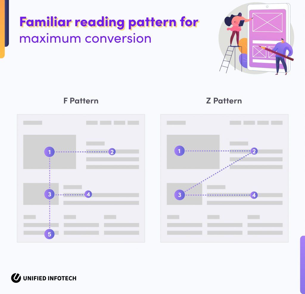
Besides the familiar pattern of content distribution, we make use of proper headlines and bullets to make the hierarchy more prominent. This way the users are well aware of what information they are about to access beforehand. Maintaining this kind of content hierarchy throughout the pages makes it easier for the users to surf the website, and increases chances of conversion with page design.
C. Optimal CTA Placement
CTA buttons often act as a major navigational element on an eLearning website. Whether it is a signup button or a next video button, these elements need to stand out from the rest. And that’s why we take special care when it comes to CTA placement.
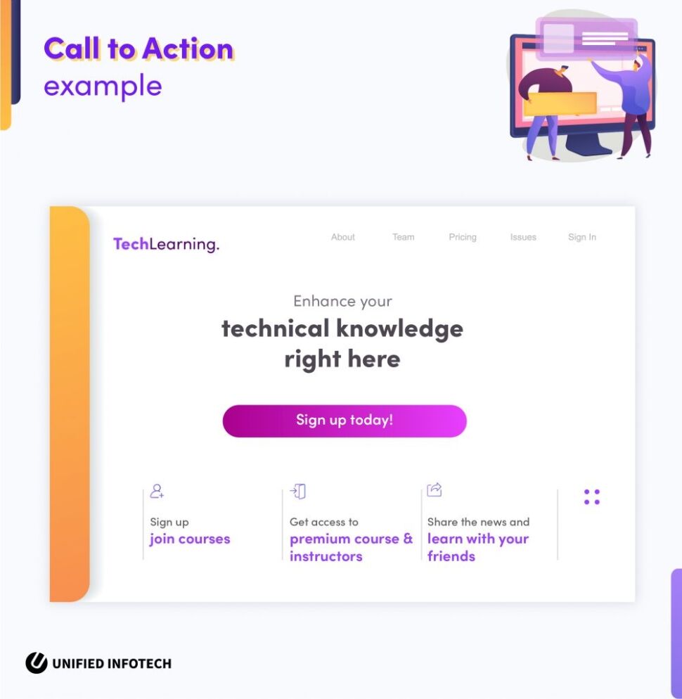
Here are some of the specific CTA strategies we follow when designing an eLearning platform-
I. Make The CTA Prominent
The first strategy is to make sure that the CTA design is prominent and easy to spot. This can be ensured in two ways- the first being the design of the CTA and the second being the placement of the button.
For the design of CTAs, we follow the brand color guideline, making it stand out among the rest of the content on the page. Along with that, we also place the CTA on an easy-to-spot place using the rule of the thirds so that the user notices the call to action as soon as they land on the page.
II. Use Strong & Concise CTA Text
The CTA message/text needs to be strong, concise, and emotional. Due to the lack of space in the e-learning UX design, we must use only a few words to explain to the user what is about to happen once they click on the CTA. Additionally, the CTA text cannot be too commercial. For an eLearning website, the message must excite and encourage the users, not make them wary of another commercial gimmick.
III. Make The Destination Obvious
When it comes to CTA placement, the main rule is the rule of no surprises. The users want to be taken to the expected pages. Taking them to any other page or another website will not be satisfying. And that’s why we make the CTA text strong yet obvious to understand so that the user knows what will happen when they click on the button.
D. Integrating Valuable Features & Functionalities
Last but not least we come to the matter of features and functionality. The right feature contributes to the conversion-focused website design a lot more than anyone can anticipate. To go head to head with your competitors, you must have the most essential features that make the experience on the site positive. Here’s a list of features that our web and custom software developers suggest enhancing the conversion of the eLearning platform –
I. Basic Profile Creation & Management Feature
The first and most important of all the basic features are the profile creation and management options. With this specific feature element of effective e-learning design, the users can create a personal profile on the platform, add and edit information, and manage easily. To use this feature the users can either make use of email and password, or they can sign up using any social platform.
II. Gamified Experience
Small animations, colors, and micro-interactions- all are part of the gamified experience. Such small elements of design make the learning activities even more engaging and compel the users to carry on using the platform. Along with improving the e-learning platform ergonomic design, it also enhances conversion in large numbers.
III. Data/Progress Analysis
The data/progress analysis feature helps the learners online to understand how well their learning practices on the platform are going and how much they need to improve. The comprehensive database dashboard design for e-learning systems holds all kinds of analytical information about the user’s activities on the platform – from how many hours they have spent on the platform learning to final evaluation. This single feature will enhance the efficiency of learning on the platform a lot more and ensure conversion.
IV. Accessibility Option
Accessibility goes a long way to convert consumers to your platform. Even within the target audience, there will be many users with specific needs. Through accessibility features, we create a high-quality e-learning platform ergonomic design, that enhances the user experience on the platform.
Accessibility features such as language support, image alt text, video subtitles, website dark mode, all these features may seem simple, but make a big difference for many users out there. And that’s how through conversion-focused eLearning website design we ensure that every learner’s needs are taken care of on the eLearning platform.
Are You Ready To Follow The eLearning Design Path To Success?
Ergonomic design and focusing on conversion- the combination of two worlds can bring your eLearning platform a complete success. However, you need expert help to imbibe both these principles within the platform. So in case you have any questions, send us a message cause our design experts are ready to solve any questions you might have.


